-
The Difference Between Reflected Light and Projected Light
Posted on March 16th, 2011 No commentsReflected light is composed of a certain percentage of each true primary colour (Yellow, Red and Dark Blue). If we consider a mid Green consisting of 50% Blue and 50% Yellow, the reflected energy is much less than the same area having all Yellow. It is also much more than the same area having all Blue.
If you think of any pigment as a number of very small tiles each having its own colour, then if you only have Yellow tiles and Blue tiles to play with, your overall possible perceived colours are limited to all Yellow, all Blue or limited shades of Green. The maximum energy emitted from any area of the pigment would be if only Yellow tiles were used.
If you have some White tiles you can have a lighter Yellow, a lighter Blue or an extended range of Greens i.e some lighter.
If you have some Black tiles you can have a darker Yellow, a darker Blue or an extended range of Greens i.e some darker.
With projected light it is more more complex. There are two different situations with projected light.
Type 1. If you have source of ‘true’ Yellow light that shines through a series of small square holes separated by similar sized small Blue filters., the resulting colour will be a light Green. This is because some of the Yellow light will pass through the Blue filter producing a dark Green. This dark Green, when added to the Yellow will create the light Green. In comparison with the coloured tiles in which we had Yellow and Blue tiles, we now have, in effect, Yellow and dark Green tiles. {See Colour Filters}
Type 2. See Projected Light.
Author – Brian Williams.
-
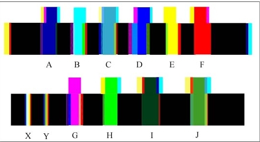
Colour Test Bars – 2 of 2
Posted on October 16th, 2010 No commentsThe use of these test bars gives us a method of accurately determining ‘True’ colours and also giving an accurate specification for any colour. At present there are no reliable standards for colours. You can compare colour charts from all sources without getting a match for a stated colour. It also gives us a more reliable method of measuring colour blindness.

Blue Slit
Red Slit

Yellow Slit
Obviously my method of using the computer monitor as the colour source only gives approximations. As a pensioner I am unable to spend £millions on buying equipment. My total outlay on scientific equipment for this series of experiments was under £5.00.
The extra energy added to the colours due to the radiated Black screen energy of 1.5 micro amps made a serious distortion in the colours, particularly the Blues.
Author – Brian Williams
-
Colour Test Bars
Posted on October 13th, 2010 No commentsThe drawing below is one I originally produced some 15 years ago as a cross-check on my theory that the spectrum colours originate from edges. It turned out to give quite a large quantity of information that confirms my theory.
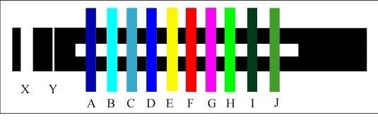
Test Bars 1A
Viewing different areas of the above through a prism gives you the various spectra shown below. I have tried 60°, 45° and 30° prisms and find that a 45° prism gives the best overall results. It is also the most readily available, from old cameras and binoculars.
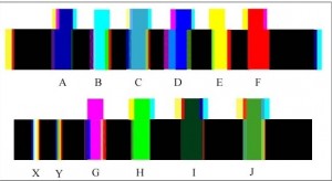
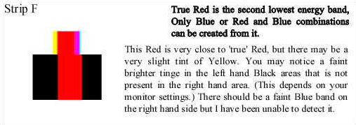
At first the spectra below don’t seem to make much sense. However, if you bear in mind my previous pages it all starts to make sense. Note that I cannot guarantee the colour accuracy on your monitor or printer, I have had difficulties producing the colours actually seen, and some of the colours are definitely “off colour”. In practice you will probably see some faint strips that I consider to indicate that there is another colour in the pigment or being projected.
Note: The viewing distance between the screen and the prism affects the width of the bands.
It should be remembered that we are dealing with energy levels. A black screen radiates approximately 4.5% of the energy of a White screen, so that this may partly explain the less prominent colour bands, as it is produced from Cyan/Blue, Magenta/Red and Yellow/Green phosphors.
The next 3 sketches explain the colour bands on silhouettes of Blue, Red and Yellow.
It should be noted that a higher energy colour will encroach into part of the space occupied by a lower energy colour.
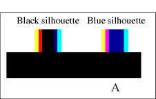 With a black silhouette, (Black being an absence of any colour energy) the Blue light dissipates readily into this area, which sometimes makes it difficult to see. Some Red may also encroach into this area.
In the Blue silhouette the Blue band becomes part of the silhouette that is radiating the same energy level. The energy gradient from White to Blue is less than the energy gradient from White to Black therefore there is no separate Blue band. The Red band encroaches on the Blue area creating a turbulence we perceive as Magenta.
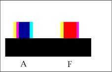 With the Red silhouette the energy gradient is less therefore we lose the Red band.
The Cyan band merges into the Red area creating a turbulent mixture we see as Magenta. The Red band is part of the Red silhouette, which leaves us with a Yellow band.
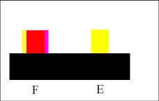 With the Yellow silhouette the energy gradient is only one step, i.e. White to Yellow; therefore there are no intermediate colour bands.
Magenta and Cyan.
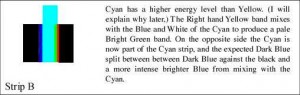
Now let us consider the ‘oddball’ colours, Magenta and Cyan. Both of these, as silhouettes, give a clean strip without any side bands when viewed through the prism. (Note: There are some very narrow bands but I consider that these are caused by carry-over from the screen phosphors.)
This is due to the high turbulence between White and the Blue in both Magenta and Cyan. The eye/brain cannot accurately determine the ratios of colours due to the fluctuating energies, but is aware of which section of the cones the signals are coming from, and the brain decides that fluctuating energy in the Blue area of the cones plus White light gives us Cyan, and that fluctuating energy in the Blue and Red areas of the cones plus White light gives us Magenta.
Without the high proportion of the White light, the brain can handle the fluctuations giving us Purples, Mauves etc. in various hues.
 Screen or printed colours are a problem. I have not yet been able to reproduce the actual colours obtained from edges and prisms. The White intensity does not affect the primary colours Yellow, Red and Blue. Nor does it affect Cyan and Magenta. I have checked this using a White intensity three times greater than the screen White without any perceived difference.
It does affect the width and intensity of other colour band combinations. There should be no Yellow in the Magenta but Magenta has approximately the same energy level as Yellow.
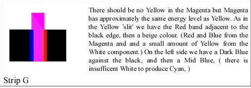
As in the Yellow ’slit’ we have the Red band adjacent to the black edge, then a beige colour. (Red and Blue from the Magenta and and a small amount of Yellow from the White component.) On the left side we have a Dark Blue against the black, and then a Mid Blue, ( there is insufficient White to produce Cyan. )
The use of these test bars gives us a method of accurately determining ‘True’ colours and also giving an accurate specification for any colour. At present there are no reliable standards for colours. You can compare colour charts from all sources without getting a match for a stated colour. It also gives us a more reliable method of measuring colour blindness.
Blue Slit
Red Slit
Yellow Slit
Obviously my method of using the computer monitor as the colour source only gives approximations. As a pensioner I am unable to spend £millions on buying equipment. My total outlay on scientific equipment for this series of experiments was under £5.00.
The extra energy added to the colours due to the radiated Black screen energy of 1.5 micro amps made a serious distortion in the colours, particularly the Blues.
Author – Brian Williams
-
Energy of Coloured Light
Posted on October 11th, 2010 No commentsAbout 12 years ago I carried out this simple experiment to assess the energy of coloured light. I connected a photocell to a micro-ammeter and mounted them in front of my computer. I then set up a rectangle in Autocad with a fill colour and zoomed in to give a full screen colour. I then took readings from different screen colours.
The chart below shows the readings obtained. Note;- This is a short version, I am still having difficulty with transferring the larger one which gives far more colours. I will add this when I have sorted the problem out.
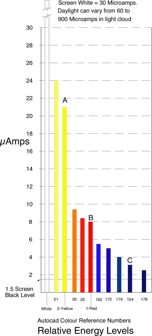
This is a very crude experiment and is only approximate. I have 4 computers and the colours show considerable differences on each.
The colours marked A, B and C are the primary colours as seen though a prism, when viewing a wide slit.
I compared these using another prism when taking the readings, and the Red and Yellow are very close, but the Blue is more difficult to determine. This post has been produced on Ubuntu Linux with the drawing done on my old Apple 8500 server. The Blues on the Linux appear a lot lighter.
I checked the energy for a Black screen which gave a reading of 1.5 micro-Amps. This additional energy probably accounts for the difficulties in establishing readings particularly in the low energy range of colours.
Varying the energy level of the White light did not effect the energy levels of the primary colours Yellow, Red, and Blue, marked A, B and C on the chart or its perceived colour.
It did affect the paler Reds and paler Blues indicating that they needed White light to obtain their different colours.
MORE to come on this.
Author – Brian Williams
-
Light Passing Through Dense Media
Posted on October 9th, 2010 No commentsPart of the catechism of the physics establishment is that “Light is slowed when it passes through a dense medium.” As an engineer I find it a refreshing change to find something with which I can agree with the physicists. However, as it is obvious that anything (freely) passing through any medium will slow down, it is not really an earth shattering ‘discovery’. Note: Anything constrained to pass through a medium may in fact be forced to retain its original speed, or even to increase its speed. This point is of particular importance in explaining some colour phenomena.
The important point about the statement is in its relationship to experiments carried out to verify it.
White light passing through different lengths of ‘dense’ medium, showed different colours depending on length.
The light exiting from the longest length of ‘dense’ medium was blue.
The physicist’s conclusion from this fact is that only the blue light had sufficient energy to pass through the dense medium! Note: This is one of the ‘proofs’ claimed by physicists of the higher energy of blue light.
Let us look at this conclusion. Consider 3 lengths of a ‘dense’ medium.
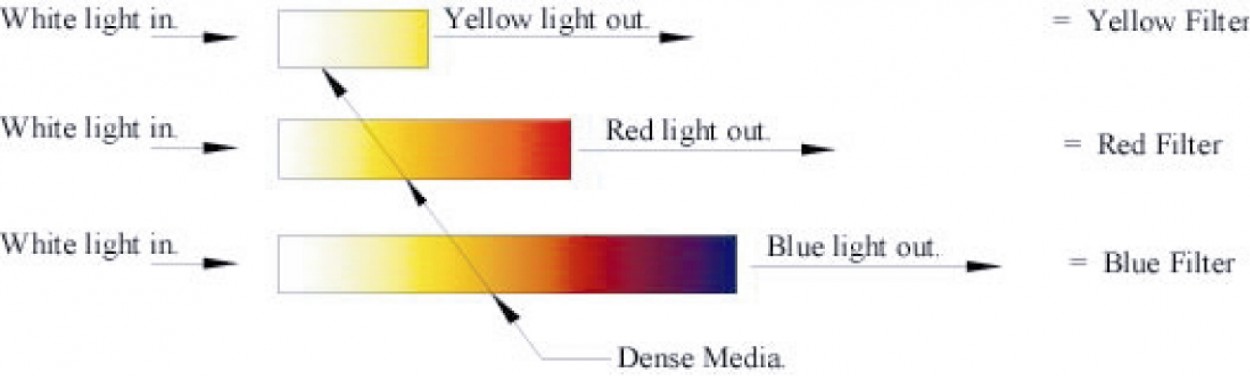
Dense Media
Length No.1 (the shortest) emits only yellow light.
Length No.2 (the mid length one) emits only red light.
Length No.3 (the longest) emits only blue light.
The energy of the light exiting the dense media gives Yellow as the highest and Blue as the lowest energy.
The bottom strip is really a true (possible) spectrum. If you removed the interface colours, Orange and Purple you would be left with a perfect spectrum of White, Yellow, Red and Blue. Note:- This is only a spectrum relative to the human eye, other creatures may have different ranges.
But according to the physicists only Blue light has the energy to pass through the longest length!
Any engineer who proposed such a naïve conclusion would have been demoted to tea-lad, (Under supervision.). If we equate the above filters with water passing through a pipe, then the physicists conclusion would be that if water coming from the end a 10mile x 1” diameter pipe was only at low pressure then this meant that only low pressure water had the energy to travel that length of pipe!
For those of you who (like physicists) have never had any interest in mechanics, the water pressure in your pipes depends on how far you are from the supply pumps. If you are within a few hundred feet from the pumps your water pressure is very high, if 10 miles away , very low. This is because energy is lost due to friction and other reasons. The same thing applies to light.
Oddly enough, (or logically), you do not get Cyan, Green, Magenta, Mauve, etc., etc, you only get White, Yellow, Red and Blue and interface mixtures such as Pale yellow, (Between White and Yellow) Orange, (Between Yellow and Red), and Purple, (Between Red and Blue). You do not get Cyan because Cyan is a mixture of White and Blue, and in the experiment this cannot happen because of the intervening Yellow and Red bands. You do not Green because Green is a mixture of Yellow and Blue and this cannot happen because of the intervening Red band. You do not get Magenta because Magenta requires compression, a situation that I will explain later.
In the magnificent photograph below you see an example of light passing through a dense medium. It shows a cloud layer passing over an active volcano. [This photograph was passed to me by e-Mail, from an unknown source. Over a year I get thousand of photographs with no information on the source]
Where the cloud layer is thinnest, bright Yellow is seen. As the cloud gets thicker, the colours go through deeper Yellow then Orange then Red then Purple. Interestingly, where the sun is shining on top of the cloud layer a dark Brown/Khaki is seen. You are seeing this by projected light from your computer. you would be seeing the photograph by reflected light. The only difference between the two is due to limitations of colour handling of your monitor and the limitations of photo printing.
Author- Brian Williams

Volcano Cloud
-
Complimentary Colours
Posted on April 1st, 2010 No commentsTry these simple experiments.
1. Stare at a Yellow coloured shape for about 30 seconds and then look at a white sheet. Make a note of what you see. Answer 1A
Carry out the same experiment again, but this time make a note of the background colour surrounding the shape. Answer 1B
Carry out the second experiment again but whilst still noting the background colour, note the colour of the shape. Answer 1C
2. Carry out the same experiments again but using a Red shape. Answers 2A, 2B, 2C
- Carry out the same experiments again but using a Dark Blue shape. Answers 3A, 3B, 3C.
Also carry out the same experiments, but instead of looking at a white sheet, just close your eyes.
It is essential that you carry out these experiments yourself without any input from me, otherwise I would be rightly accused of leading you.
The apparently strange results are due to the mechanics involved in the structure of the eye.
It could be advantageous to everyone (including me) if your results were published on this website so that the results would be available to all, and I could proceed to the next stage with a some independent experimental results.
Sadly, I have not received a single reply on this posting in 12 months.
-
Printer Colours
Posted on March 16th, 2010 No commentsThe printer colour cartridges Yellow, Magenta, and Cyan, are actually pale Yellow, pale Red ( Although some do have a small percentage of Blue) and pale Blue. They depend on the White of the paper and Black to create the various colour approximations.
In the lighter Yellow range control is by reducing the ratio of Yellow spots to allow more White to show through. In the darker Yellow range control is by adding varying ratios of Red or Black spots. If only Black spots are added it gives an impression of a darker Yellow, but if Red is added it gives an Orange/Yellow Ochre impression which people still consider to be Yellow. An artist will tell them differently.
In the lighter Red range control is by reducing the ratio of Red spots to allow more White to show through. In the darker Red range control is by adding varying ratios of Blue or Black spots.
In the lighter Blue range control is by reducing the ratio of Blue spots to allow more White to show through. In the darker Blue range control is by adding varying ratios of Red or Black spots. Black only gives a darker Blue.
Red only gives such Blues as Royal Blue etc. which have a higher energy than ‘true’ Blue.
Many papers have a distinct Yellow tint, and the White energy of ambient light, both affect our viewing of the finished print.
-
Projected Light
Posted on November 22nd, 2009 No commentsFig.1 shows the overlapping light beams as shown in most books on physics to try to convince the public that white light is composed of all the other colours.

Unfortunately the illustration does not show the actuality, because there are no neat uniform areas of colours as shown. The light projectors do not project an even circle of colour as shown because the high intensity white beam always shows through the filters.
Consider the following extract: ‘It is an advantage if the projectors are controlled by rheostats, so that the relative intensities can be controlled in order to produce a good white’. From PHYSICS – An Examination Course. By E. L. Hansen. Hulton Educational Publications Ltd. In other words, if the physicists cannot obtain the results that they want, they are allowed to cheat. To be fair they don’t understand that it is cheating.
If you look at a Blue filter lying on a white sheet you see an even blue shade across the whole filter. If you shine a light through any filter you get results similar to those shown below.

It is obvious that a considerable amount of white light is coming through the filters. If we re-label the above drawing to allow for this white light we arrive at the following drawing.

In the above drawing we are looking at the combined colour energy levels in particular areas. We are also getting dangerously close (If you are a physicist) to the artists colour mixing principles.
In the ‘Yellow’ area the combination of colours would give a yellow ochre. In the ‘White’ area the combination would give a very light grey. The white intensity from the lamps is very much higher than the white intensity from a ‘White’ screen, and therefore a relatively small amount of white light has a far greater impact than you would expect. Referring back to the chapter on the energy value of coloured light, the white light from the lamps has a probable intensity of at least 10 times greater the yellow light from the filters.
See ‘The Origin of Colour’, Taper Slit experiment, Taper Silhouette Experiment.
Technorati Tags: Projected Light,Colour,Colour – New Experiments,First published November 22nd 2009 -
Colour – Williams’ Taper Silhouette Experiment
Posted on November 22nd, 2009 No comments.
For our second experiment we use a tapered silhouette as shown.

If you view this silhouette through a prism you will see a spectrum as shown below.

In the above view the Blue and Red bands are forced into occupying the same space, therefore the combined energy plus some turbulence gives us Magenta. Where you would expect Green i.e. where the Blue and Yellow bands cross, you have the extra energy of the Red light in the Magenta which is being squeezed into the same area. This forces the total energy back into White. This I refer to as a ‘compression spectrum’.
It should be remembered that in the slit experiment the light can expand into the dark area. In the silhouette the colour bands are under pressure from the surrounding White light. Regarding the hypothesis that Yellow light is a combination of Red light and Green light, there is no evidence of any Green light. If there was a Green band between the Yellow band and the surrounding White I might have been interested in the hypothesis.
Note: Light acts in exactly the same way as any fluid, and follows the laws of fluid dynamics.
Abstract from Physics or Fantasy – Section 2 – Colour and the Quantum Theory
See also Williams’ Taper Slit experiment
-
Colour – Williams’ Taper Slit Experiment
Posted on November 8th, 2009 No commentsTo demonstrate that Green and Magenta are not ‘Primary’ colours, the following simple experiments are presented. For the 1st experiment, we have a tapered slit in place of the normal parallel slit.

If you view this slit through a prism you will see a spectrum as shown below: –

- As the Yellow and Cyan (Bright Blue) bands overlap the result is Bright Green.
- As the Red and Blue bands overlap the result is Purple.
- As the Yellow and Blue bands overlap the result is a Mid Green.
- As the Cyan and Red bands overlap the result is Mauve (Light Purple).
These are exactly the same as the artist’s mixing rules.
The physicist’s distorted ‘Standard’ spectrum forces them to argue that a completely different set of physics laws must apply to light.
Notes
- At the thin end of the slit the amount of light passing through is drastically reduced and makes it difficult to accurately determine the colours.
- The Cyan band is caused by the interference effect between White and ‘true’ Blue.
You will notice that there is no Magenta involved. Magenta requires a certain amount of compression to create the additional energy and should not be confused with the Mauves and Purples.
The Slit and Taper Slit spectra are what I call ‘Expansion Spectra’.
Short extract from Physics or Fantasy – Section 2 – Colour and the Quantum Theory.